5 Signs Your Website Is Costing You Customers (And How to Fix It)
Your website is supposed to be your hardest-working employee—generating leads, building trust, and converting visitors into customers 24/7. But what if it's doing the opposite? What if your website is actually driving potential customers straight to your competitors?
The scary truth is that most business owners don't realize their website is underperforming until they see the data. Here are five warning signs that your website might be costing you customers—and exactly how to fix each one.
Sign #1: Your Website Takes More Than 3 Seconds to Load
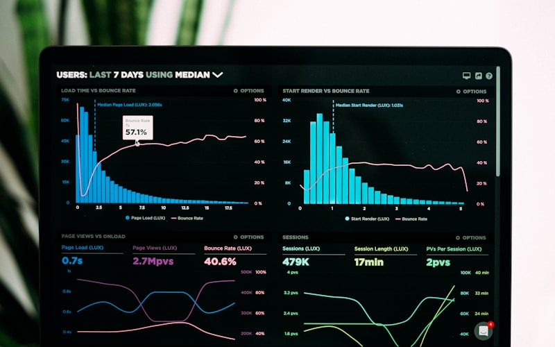
The Problem: Google research shows that 53% of mobile users abandon sites that take longer than 3 seconds to load. Every additional second of load time increases bounce rate by 32%.
Think about your own behavior: when was the last time you waited patiently for a slow website? You didn't. You hit the back button and clicked on a competitor.
How to Check: Use Google's free PageSpeed Insights tool (pagespeed.web.dev) to test your site. Aim for a score of 90+ on mobile.
How to Fix It:
- Optimize and compress all images
- Enable browser caching
- Minimize code and scripts
- Use a fast, reliable hosting provider
- Consider a complete rebuild with performance-first architecture
Sign #2: Your Site Isn't Mobile-Friendly
The Problem: Over 60% of web traffic now comes from mobile devices. If your website doesn't work perfectly on phones and tablets, you're invisible to the majority of potential customers.
Google also uses mobile-first indexing, meaning your mobile site determines your search rankings—not your desktop site.
How to Check: Visit your website on your phone. Can you:
- Read all text without zooming?
- Tap buttons easily with your thumb?
- Navigate without frustration?
- Find your phone number and click to call?
How to Fix It:
- Implement responsive design that adapts to all screen sizes
- Use larger, touch-friendly buttons
- Simplify navigation for mobile users
- Make phone numbers click-to-call
- Test on multiple devices regularly
Sign #3: Visitors Can't Find What They Need
The Problem: If visitors can't find your contact information, services, or pricing within seconds, they'll leave. Confusing navigation and cluttered layouts create friction—and friction kills conversions.
Studies show that 94% of first impressions are design-related, and 75% of users judge a company's credibility based on their website design.
How to Check: Ask someone unfamiliar with your business to find:
- Your phone number
- Your services/products
- How to contact you
- Your pricing (if applicable)
Time them. If it takes more than 10 seconds for any of these, you have a problem.
How to Fix It:
- Simplify your navigation to 5-7 main items maximum
- Put contact information in the header and footer
- Use clear, action-oriented buttons ("Get a Quote," "Book Now")
- Create a logical page hierarchy
- Remove clutter and unnecessary elements
Sign #4: You Have No Clear Call-to-Action
The Problem: Every page on your website should guide visitors toward a specific action. If visitors don't know what to do next, they'll do nothing—and leave.
A website without clear CTAs is like a store without a checkout counter. People might browse, but they won't buy.
How to Check: Look at your homepage and key landing pages. Is there:
- A clear primary action you want visitors to take?
- A button that stands out visually?
- Urgency or incentive to act now?
How to Fix It:
- Add prominent CTA buttons above the fold
- Use action words: "Get Started," "Book Your Free Consultation," "Download Now"
- Make CTAs visually distinct with contrasting colors
- Include CTAs throughout the page, not just at the top
- Create urgency when appropriate
Sign #5: Your Website Looks Outdated
The Problem: Design trends evolve, and what looked modern in 2018 looks dated today. An outdated website sends a subconscious message: "This business might be behind the times."
Research shows that users form an opinion about a website in just 0.05 seconds. If your site looks old, that opinion is negative—regardless of how good your actual services are.
Signs Your Design Is Dated:
- Small, hard-to-read text
- Cluttered layouts with too many elements
- Stock photos that look generic
- Flash elements or auto-playing music
- Outdated color schemes
- No mobile optimization
How to Fix It:
- Invest in a modern redesign with clean, minimal aesthetics
- Use professional photography or high-quality, authentic stock images
- Embrace white space
- Update to current typography standards
- Implement modern UI patterns users expect
The Real Cost of an Underperforming Website
Let's do some quick math:
- If your website gets 1,000 visitors per month
- And your conversion rate is 1% instead of 3% (due to the issues above)
- That's 20 lost leads per month
- At an average customer value of $500
- You're losing $10,000 per month—$120,000 per year
A professional website isn't an expense. It's an investment that pays for itself many times over.
Ready to Stop Losing Customers?
At DNA Web Studio, we build websites that load fast, look stunning, and convert visitors into customers. Our sites are:
- Blazing fast (under 2-second load times)
- 100% mobile-optimized
- Designed for conversions
- Built with SEO best practices
- Delivered in 24-48 hours
Don't let your website cost you another customer.
Get a Free Website Audit → [blocked]